When I first received an email with the cover art from my editor late last summer, I was almost afraid to open it. I’d heard stories about authors who were less than thrilled with their covers, who disagreed with their publishers on the art or didn’t think the feel of their covers were in line with the vision they’d had, or had initial covers that they really liked but then saw changed for various reasons, so in that moment I tried to brace myself. What if it didn’t look anything like I imagined? What if I hated the art, or the title font, or the color? What if it was a disappointment?
After you’ve been working on a story for years and dreaming about seeing it in print, you definitely start thinking about covers. I’d never pretend to have the knowledge of a book designer or an artist, but as a reader I’ve certainly felt the pull of an eye-catching cover on the shelf, and had ideas of what I liked and didn’t like. My publisher was kind enough to ask me for my input, and I happily shared with them some book covers that I admired, but I was fully aware that it was no guarantee that they would agree with my tastes, or that I would love my cover.
So when the cover art landed in my inbox, I steeled myself. I clicked open the email. I scrolled down as the images loaded…and gasped. And then I began to cry — big happy tears of pure joy. Reader, I actually sobbed for a good long while. It was glorious and beautiful and far better than I ever could have imagined. For the first time, I felt like the words I’d been struggling with, the story that I’d been trying to tell and the world I’d been attempting to build had come together enough to be rendered into something visual. And it blew me away.
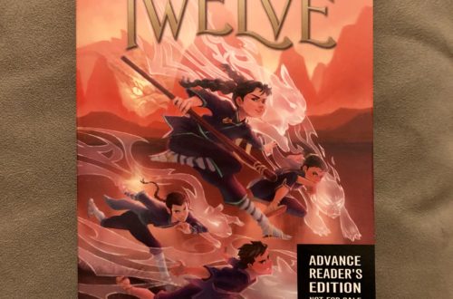
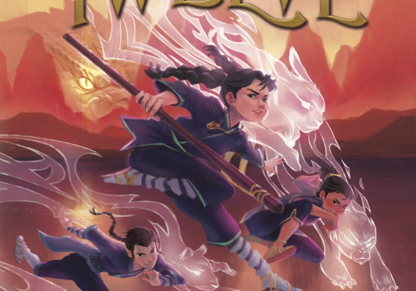
Of course, this is because the artist, Melbourne-based Sher Rill Ng, is supremely talented. She read my manuscript and was able to translate it into an incredible cover. I still can’t get over the details. I love the spirit forms of each character’s ruling animal, and the hint of the Dragonlord in the background, with the dragon’s eye as the sun. See how it reflects off the surface of the lake? It reminds me a bit of the Lord of the Rings and Sauron’s eye, which is just the coolest. I love the glowing ghostly tiger on the back, and the trim on the characters’ clothing, and how the colors correspond with their ruling elements (Wood, Earth, Metal, Water). I love the little rabbit pendant that she put around Usagi’s neck. When I first saw the cover art I felt strongly that she’d read the story, even though at the time I had no way of knowing. Later I learned that indeed she had — which in retrospect, when I look at the gorgeous cover, was obvious.
You know what else is beautiful? The colors! I love how the overall feel is so warm and inviting — and actually in line with the Pantone color of the year for 2019, Living Coral. Sher Rill swears it’s just a coincidence but I think she’s prescient and can foretell the future. Or at least is on the cutting edge when it comes to design trends.
Anyway, I am utterly thrilled with how the cover turned out, and feel so fortunate that Sher Rill was the one tapped to do it. She’s done a number of covers for books in Australia and has her own beautiful picture book coming out this year. The book designer at HarperCollins working on The Twelve, Molly Fehr, is a genius for finding Sher Rill and for the fabulous design of the book (which includes titles, typeface, binding, layout and the like). As an aside, I also love the title font that was selected. It hints at adventure and looks classic. The scrolls that bracket the title are such a nice touch! And seeing my name at the bottom is still surreal.
I can’t wait to hold the finished product in my hands, but in the meantime, just looking at the cover fills me with happiness.